Critical Reflection Presentation Link:
0 Comments
Final Double Page Spread: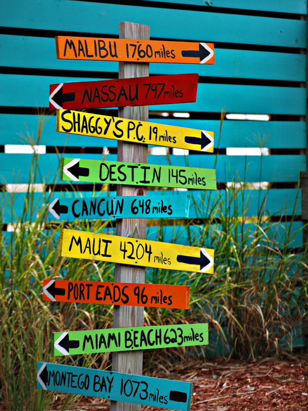 I decided to go for a very colorful, yet simple first page in the 2 page layout. I feel that the main colors of yellow, orange, red, green, and turquoise work really well together. They also go well with the second page of this 2 page layout mainly because of the blues. The image itself contains signs with locations of different places on them which goes good with the idea of the magazine, traveling. I decided to make this page not have to many words or even no extra typed words added onto it because I remember reading that there should not be too much on the page, given that there will be a lot of information on the page besides it. This side should be more image than words while the other side should be more words than image. This image is from pxhere.com. 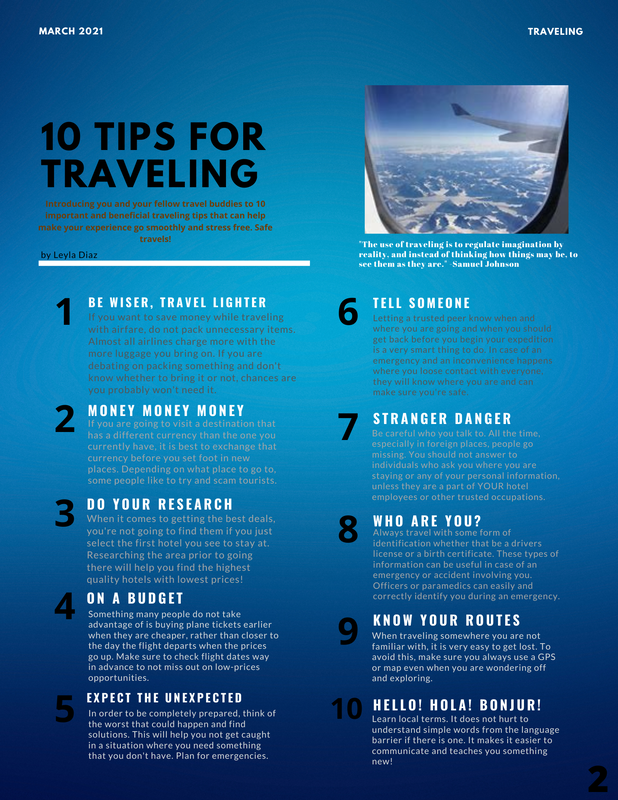 First, I decided to change the title of the page so it could match what it was called on the Table of Contents. I changed it from "The Best Travel Tips" to "10 Tips for Traveling". Then, at the top, I changed the month for the date, took out "USA Today" because that is not the name of the magazine, and changed "Travel" to "Traveling". Next, I changed the words under the title from a grey color to brown for the reason that it now stands out more. Also, I removed the white boxes that stood behind each number because some of the looked unevenly out of place. It looks neater now without the boxes. Lastly, since the color of the background is ombre with blues, some of the words or paragraphs may be hard to read because of the color of the text. So, to resolve that, I made the color of the texts start from a dark grey to a white. In between those is a lighter grey. This allows the darker text to stand out against the light blue on the background and for the lighter words to stand out against the dark blue on the background. The image at the top right is from onedayinacity.com.
Final Magazine Cover: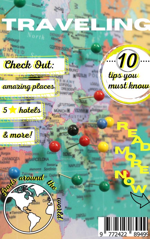 I completely changed the magazine cover- from the background picture to the words on it. I felt that this one looks more like an actual magazine. I used a color scheme mainly of yellow, black, and white in the words and designs to match the background. I used this background image from https://pinadventures.com because I felt that it nicely illustrated a map which relates to the main idea of traveling, while also incorporating fun colors. The pins on it also add an affect. The colors in the background image are very lively and I feel they attract one's eyes more than just a few shades of the same color, for example, blue in my previously edited magazine cover. I wrote some information from the table of contents to let the audience know what the magazine will consist of and even added a barcode at the bottom right to fill up some space. I believe the font used for the title "TRAVELING" fits very nicely from left to right on the page. I also explored my options with fonts for the subheadings and went for a more cursive look to add variety and another visually pleasing font to look at.
Final Table of Contents: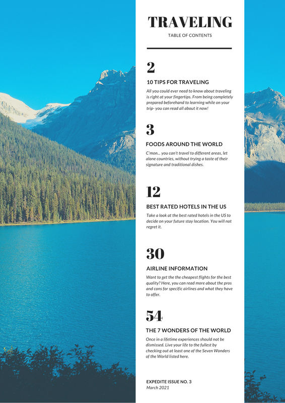 The main thing that I changed from the second most recent Table of Contents to the completed Table of Contents is the background image. This image Yes, both images both showed mountains in the background and more cooler toned colors, but this one has a much clearer view. The quality of the other picture was not as good. Next, I changed the subheadings, "THE BEST TRAVEL TIPS", "AIRLINE INFO", and "7 WONDERS OF THE WORLD" TO "10 TIPS FOR TRAVELING", AIRLINE INFORMATION", and "THE 7 WONDERS OF THE WORLD". I made the first heading change so it could match what the section of the magazine is called and how it is in the double page spread. I changed the other two headings because I figured that what I came up with after sounded more professional and complete. I only changed a few words in the short paragraphs to make it sound more inviting and gain more readers. Other than the few words that have been revised, I did not drastically change the meanings or entire topics because I felt that everything was well said and put together. This is the second to most recent Table of Contents that I edited off of: 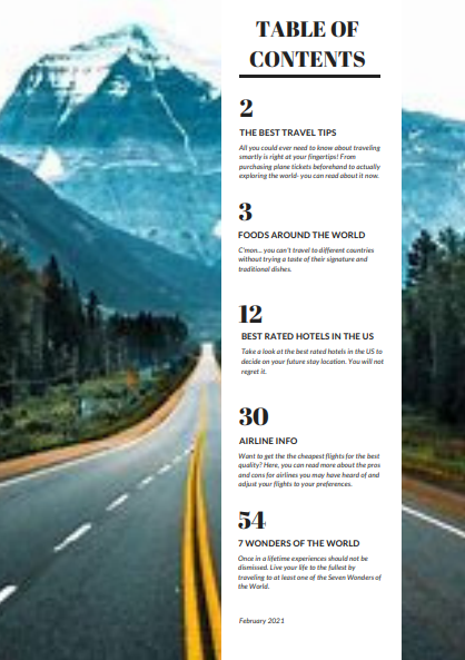 Critical Reflection Question 6 An issue raised in the targeting of national and local audiences (specifically British) by international or global institutions is the lack of variety. For example, in film, mainly in the UK, the films there appear to contain characters who fit the society standards or surroundings. What is meant by this is that there may not be too much diversity in the most popular films in the industry because the main characters are comfortably appearing to be similar to those who indulge in those types of films. The people may be white and educated which describes a majority of the population. The lack of culture and diversity can be seen as an issue and why other races or cultures are not given as much attention
Another issue could be that the marketers and institutions for the British films must know exactly what the audiences locally or nationally are looking for as their interests. Without knowing, a film may be created and does not obtain that much attention, causing profit to not be as high as it would with other films that people usually are interested in more. So, it may be hard to come up with new ideas that are similar, yet different and not exactly like the previous ones. This can either cause a gain in profit or loss depending on how good the institutions know their audiences. Table of Contents: Revision 1First version:  Second version:  The main thing that has changed between the two versions of the Table of Contents is the type of magazine it is a Table of Contents for. The first one was for children's fall fashion and the second one is for traveling tips. I felt that the theme should be changed because I have come to realize that I know more about traveling than fashion. The color scheme changed because one is more warmer tone colors while the other is cooler tone colors. I believe the colors orange and yellow match the fall aesthetic more, while different shades of blue match the traveling aesthetic more than other colors. Also, the page numbers, subtitles, font, and design over the image have changed. These smaller details were changed to make the magazine not start on page 16 because page 2 seemed more realistic. The subtitles obviously changed because the magazine is no longer about fashion and is now about travel, so the words have to change to match it. Furthermore, the white rectangular design was placed over the image to give it more detail. Overall, almost everything was changed except for the way the words are placed over the background image. They are slightly off-centered and go straight up and down because I think it shows just enough of the background image while still given attention.
Critical Reflection: Question 5My own experiences of media consumption can illustrate wider patterns and trends in audience behavior because of the ways that different people digest different material based on what they are used to or surrounded with. A reason why major surrounding platforms are used is because there is a lot of activity within, including my own activity. The more people who access media, such as film on Netflix for example, a certain way by watching more of it gains the platform’s popularity, causing wider patterns and trends in those who access it and how much it is accessed. The way I consume media, film specifically, can be through certain online websites or apps that allow me to watch the way I am used to. Movie theaters are also another option. I may watch a film as soon as it comes out to be up to date with the newness of it. Other audiences may also want to be the first to view the film for the same reasons. This causes trends and wider patterns in audience behavior where people begin to engage in certain films immediately rather than later. As a result, the activity rate, leading to profit, will increase sooner than later, and then start to decrease as the majority of the audiences that are consuming it have already seen it. This could either be a dealbreaker or positive thing for media companies in this industry depending on how much they have gained or are expected to gain in the future.
Magazine Cover Revision 1: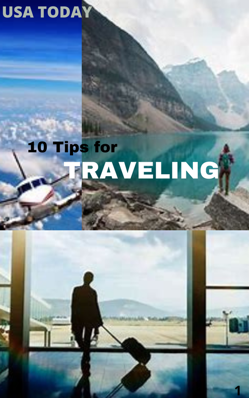 I changed the color and size of the words "USA TODAY" because I felt it was taking up too much space for not being the title and it was attracting more attention than it needed to. That is why I changed it to gray from white and decreased the font size. Next, I enlarged the sizes of the images to take up more space because I removed the "notebook-like" elements. I did this because it looked like it had too much blank spaces. Then, I changed the color of the word "TRAVELING" to make it stand out more. Before, it was in black lettering and now it is in white lettering because it looks more vibrant against the images. 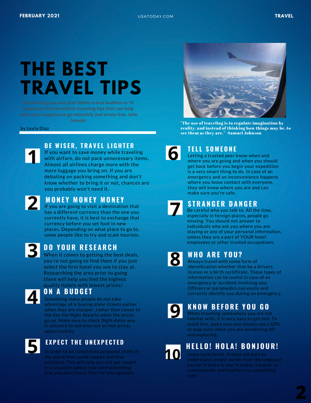 First, I changed the coloring of the words under the main title for this page because I wanted it to match the color scheme more. I think the gray color is a better fit than the brown. Secondly, I decided to space out the text very slightly because I thought it was too close to the bottom of the page. So, all the paragraphs and subtitles were moved up. Also, I changed the tip number 9 name from "KNOW YOUR ROUTES" to "KNOW BEFORE YOU GO". I thought this was a better fit and is easier to remember because it is more catchy than the first one. Lastly, I fixed a typo in the title of tip number 10. Before, it spelled "BONJOUR" as "BONJUR". Now, it is spelled correctly. Citations for images:
Images: First page: Top left image (airplane): by pixelstalk.net Top right image (mountains): by Conde Nast Traveler Bottom image (in airport): by ABC News Second page: Top right image (out of airplane window): by onedayinacity.com Text Analysis: Question 5 The continuing development of digital media technology is very significant for media institution and audiences. Digital media technology is constantly changing and advancing. This allows for new ways to be constructed and used for certain products. Most media organizations have to stay up to date with the new developments or else they will lose their audiences. A lot of these people which engage in technology material have the idea that newer is better. So, older ones seem outdated and not as good. If media institutions decide to not continue advancing, this could “destroy” their profits and cause a decline in their future of buyers. For example, new iPhone models are constantly being constructed. Audiences notice this and most of them buy the newer versions, making the older versions less relevant. Overall, the continuing development of digital media technology creates the base of the platform for what media institutions have to create in order to stay in business and what audiences get used to by viewing or consuming.
Magazine Double Page Spread Draft Analysis The first page of my magazine shows three images directly related to traveling. They all go well with the title of the magazine "10 Tips for Traveling". The layout of the images and how they are placed leaves space for the title and its elements. I believe that that the background for the title, which seems to look like notebook paper lines with blue tape on two of the corners, corelates to the "10 Tips" part because usually people write down tips on paper.
The second page is very blue and goes along with the color scheme of the first page. I chose blue because when people think of traveling, the usually think of flying to new places and planes fly in the sky which is blue. The white subheadings stand out against the blue background and the numbers, as well. For the most part, the amount of wording in each paragraph is about the same which I think looks good because it is evenly distributed. |
 RSS Feed
